As harvest begins to wrap up and our minds shift towards next year, for many of us that brings opportunity, optimism, and perhaps a bit of concern. With rising input costs, we as growers are going to be forced to make some tough decisions between economics and agronomics. As an agronomic consultant and grower myself, when those decisions come up for our operation, I look to my yield data to help guide me. Sometimes it takes looking at our yield data through different lenses though to help make those decisions. (For reference, I am using AgLeader SMS Advanced as my data software).
Lens #1: A Normalized Yield Map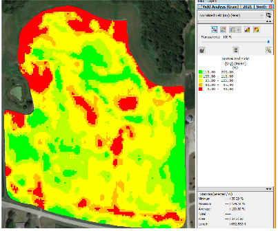
For me, this is the best way to view yield maps. Normalizing your yield map against the mean yield of the field, creates a clear picture of the low, average, and best producing parts of your field. You can do this with a single year of yield data or multiple years. I prefer to run this function with at least 3 years of the same crop data. This gives me a clear picture of how certain areas of my field perform when in that selected crop. From here, the normalized yield map allows me to make informed, data proven planting and fertilizer prescriptions because I know which parts of my field historically perform at, above, or below average.
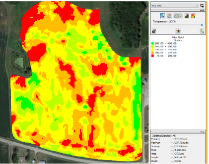
Lens #2: A Multi-Year Maximum Yield Map
When you stack multiple years of yield data on top of each other, AgLeader SMS has a function that allows you to see the maximum yield ever reached in each part of the field from the years that were selected. This function allows you as a grower to see what the yield potential has been for each area of your field. Knowing this allows you to recognize where savings opportunities for inputs could be or where you could invest money and see a good return. If you know certain acres of your field have peaked out at 160 bushels per acre over the last 3 corn years, do those acres necessarily need the same amount of fertilizer or seed that parts that have the potential to make 250 bushels need?
Lens #3: Yield vs Soil Test Correlation
When looking at dry fertilizer prices this fall, its easy to just want to cut everything back across the board. However, how do we make sure cutting back doesn’t cost us yield? When you run a correlation analysis between recent yield data and a recent soil test, we are given insights as to which nutrients are driving or hindering yield. In our chart to the right, we can see some decent positive correlations between our Base Saturation K Percentage and K ppm. We also see our Base Saturation Mg Percentage is hindering yield. This kind of analysis not only provides us with data to help us know which nutrients we can and can’t skimp on, but it also shows us how certain nutrients may relate to one another within our soils.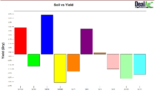
This fall when harvest wraps up, I encourage you to not just settle for printing your yield maps and calling it good. Invest in a good data software program or get with your trusted advisor and dig deep into your yield data. You may be surprised at what you can find!
About the Author: Tyler Deal


 and then